Just when we thought the selling would never stop… the S&P does an about face and rallies up 20%.
It almost reminds me of seeing those UFO videos where some strange object turns on a dime and zips off in another direction…
Like it’s giving gravity the middle finger.
The latest low came in on July 17th and would you like to take a guess what reverted just days before that?
If your guess was YIELDS… you get a gold star!
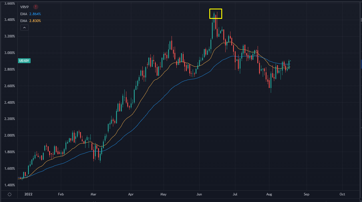
Check out a chart of the 10-year US Treasury Bond:

10-year treasury bonds chart
The little yellow square at the top? That was July 14th.
It seems the non-continuation into another nasty storm of bad news on inflation was a massive signal.
And no, I’m not just playing “Professor Hindsight”…
We pointed this pattern out all the way back in May when the market had a huge move higher.
The macro baseline in the backdrop is strumming a catchy tune that’s easy to pick up…
The Cliff’s Notes version is this:
Governments around the world went on a major spending binge that led to the inflation hangover that’s marked the last year or so.
All the vaunted “experts” who we should trust without question…The CEOs, Central Bankers, Politicians and Analysts… they all ignored (or deliberately hid) the early warning signs.
The stock market is in a proper bear market… but the bond market has been a raging dumpster fire.
And it wasn’t until yields cooled off that we could have the 20% rally in equities we’ve been enjoying for the last few weeks.
That’s why you should have eagle eyes trained on what bonds are doing right now.
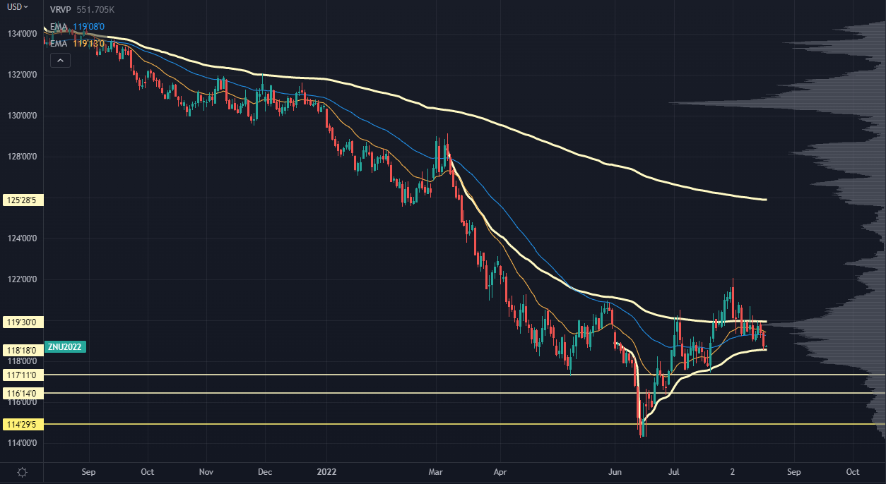
Let’s take a quick look at the 10-year futures:

10-year futures chart
As the yield on the 10-year goes up, the price of the bond goes down.
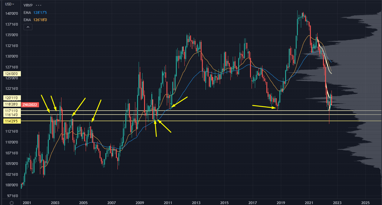
The two horizontal lines are massive, multi-year levels where we have seen some key price interactions that span years.
But as you can see here:

Bonds Downtrend Chart
The market is still in a proper downtrend.
We might be looking at a cross between the 20 and 50 day EMAs, which might just market the start of another downtrend.
Right now, we’re at a major crossroads -- the swing AVWAP (anchored volume-weighted average price) from the recent lows.
If the 10-year loses this level and gets held under it for an extended period…
I don’t think we’ll find a lot of brave souls willing to jump out of that trench into the raging guns of inflation.
So right now, this is the level to watch.
If we start to see the bond market go “Helter Skelter” again, consider protecting your portfolio with hedges and position size.
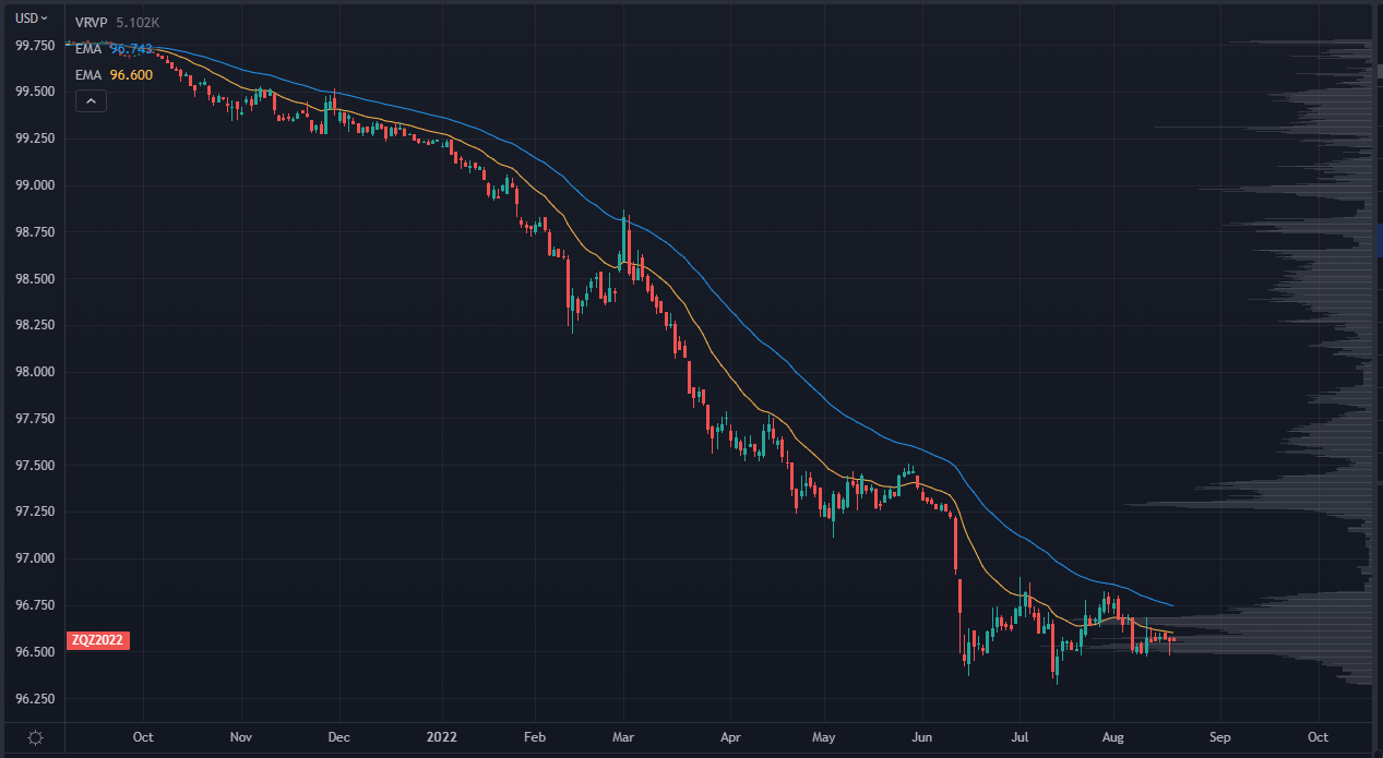
Now, for a bonus chart -- ZQZ2022:

ZQZ2022 Chart
This is the chart for the December Fed Fund Futures.
There’s currently an expectation of about 3.5% into the end of the year.
If this contract rolls over, it means the market will be anticipating more aggressive rate hikes.
That could lead to a short term tantrum in tech and other risk assets.
This gives us a great backdrop to find some insiders buying into the dip.
If we see these guys buying into the face of new rate hikes… that’s a sign you’re in for a pop!
Want to know how you can find out what insiders are doing?
And how you can bag 1000% plus returns in ANY market?
>>> Show Up Here at Noon And I’ll Show You How
Original Post Can be Found Here