SPY
SPY Chart
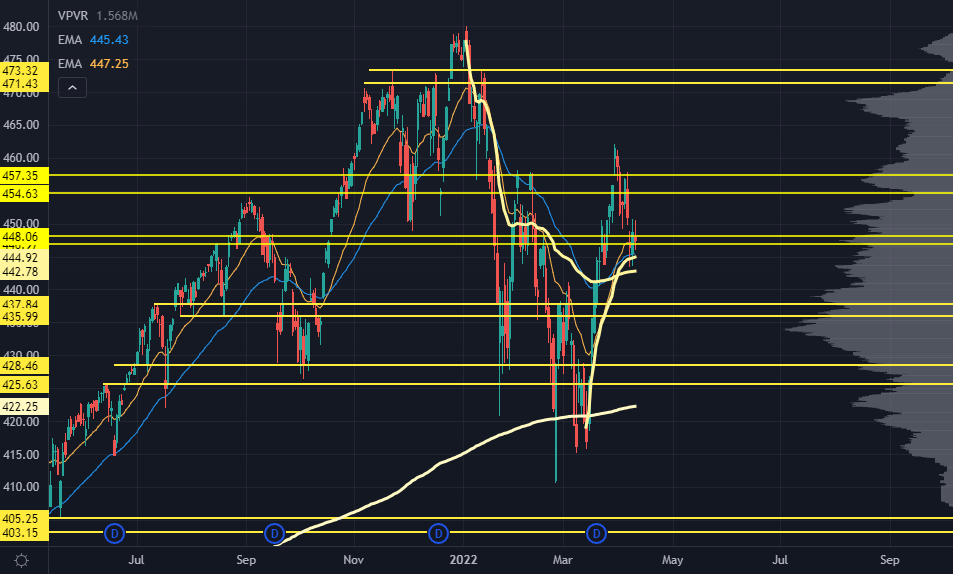
The markets saw a little more of a giveback this week. We were keying the 448 level to start the week — and while we did crack through it, buyers started to show up in force at the swing Anchored Volume Weighted Average Prices (AVWAPs) we had lined up.
This is yet another inflection point against an area that’s proven key many times previously.
After early February’s bounce, the S&P held onto this level for about a week longer before it completely fell apart.
Granted, geopolitical risk accelerated thanks to Putin being Putin…
So we shouldn't expect the price action to be the same now. That narrative is just about fully fleshed out in risk markets.
This zone was also the key support from November and the market’s turning point in the fall of 2021. Combining that with the key swing AVWAPs gives us an idea of where buyers should keep showing up.
A break under last week's lows, and our next pivot level is the 435-437 area.
Yes — it’s an internal pivot point. But you should see some key rebalancing in the market at that point.
To the upside, we've got the 454 - 457 zone. It has some trapped inventory from last week that could probably find resistance.
If we manage to see stabilization here into April options expiration, current market volatility could make us test that level again.
A continuation of rotational corrections is possible. The broad indices look "OK" from a technical standpoint… but we’re seeing some wild moves underneath the surface.
Big banks like Goldman and JP Morgan were obliterated, but another key sector came into massive support — and Precision Volume Alerts members are playing on a fade.
You can learn how to get inside Precision Volume Alerts and join them here.
Bonds are a bit of a departure from our normal Market Primer subjects, but this is where the largest market risk resides.
An acceleration in inflation expectations has completely routed bonds over the past few months.
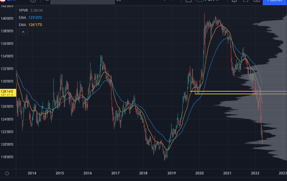
Here's a look at ZN, the 10 year bond futures:
ZN Futures Chart
Keep in mind that this is a weekly chart. Yields have shot straight up without so much as a pause, and the 10-year is back at 2018 levels.
2018 was an interesting time for the market because we were starting to see signs of inflation, and the Fed pumped the brakes so quickly, we had a tech crash. Look at AAPL and QQQ charts in the second half of 2018, and you'll see how bloody it truly was.
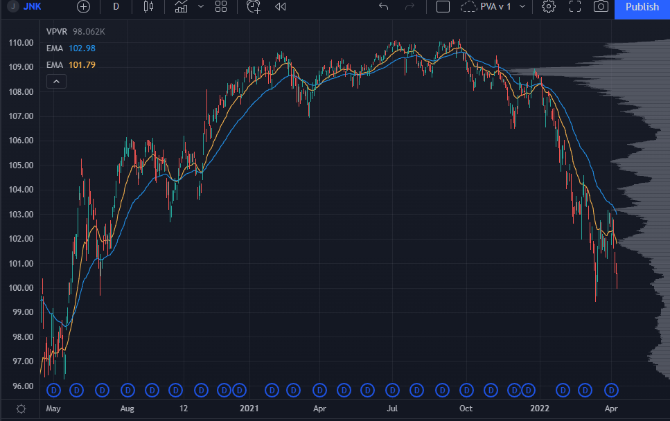
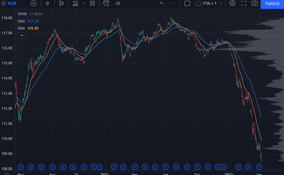
The rise in treasury yields is bleeding over into other pockets of the market.
Here's the daily chart for JNK, which holds high yield corporate debt:
JNK Chart
Here's a chart of MUB, which holds municipal bonds:
MUB Chart
I get spooked when I see the bond market make a multi-standard deviation move — all in one direction — without any breathing room.
Here's the basic premise of the bearish macro thesis right now:
Inflation is spiraling out of control. Two years of aggressive fiscal and monetary policy, continued supply chain issues, and a war in Eastern Europe are all to blame.
The Federal Reserve has to thread the needle — not hiking rates so much as to break the market but enough to ease short-term inflation expectations.
That would cause yields to rise if they did it wrong, making it harder for companies to raise capital to grow. Margins get squeezed, higher prices change consumer behavior... you know the drill.
All of a sudden, the yield curve inverts, and you have the potential for a recession...
Not immediately, but in about 12-18 months.
If things get really weird, liquidity could dry up and create a proper credit crisis.
This kind of idea is compelling but not new. Any time we get inflationary signals post-2009, there's this narrative that the Fed is stuck between a rock and a hard place.
That doesn't mean the market should be left for dead. A rising rate environment isn't always bad for stocks, and an economic contraction could come after the S&P has another 40% run higher.
The main reason I bring this up is because of the move’s speed and magnitude vs. how equities have managed to hold a bid for a few weeks. This divergence is of note.
One more consideration before we move on — If rates start to see reversion.
If treasuries rally and take the rest of the bond complex with it, high-beta tech is ripe for a massive move higher.
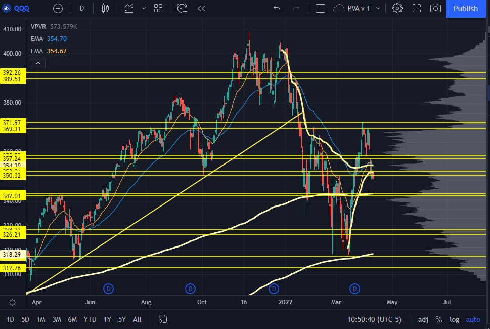
QQQ Chart
The Nasdaq had a similar mechanic to the S&P.
We had a key level at 350 that lined up with the Swing AVWAP from the March lows, and it held for a day or two. Then, we saw a continued giveback and a push into that weird volume pocket we've been seeing for months now.
Levels underneath are at 342, the volume shelf and the AVWAP from the Oct 2020 lows. This has seen responses in the past. If we see that Monday or Tuesday, it would be a great long area to take.
To the upside, we have the gap fill and prior support coming into play around 357, and then the trapped inventory from the past two weeks.
"Range" is starting to feel like the base case.
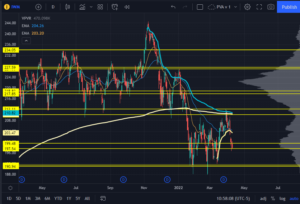
IWM Chart
The Russell 2000 was about as textbook of a fade as you could get.
We had the swing Volume Weighted Average Price (VWAP) from all-time highs and Oct 2020, and the massive resistance level that some prior longs would use as an opportunity to break even.
This is the spooky chart for me. If you zoom out a bit, you have little volume traded underneath the range lows. It was an absolute rip higher post-2020 election, and you end up with a big volume pocket...
And I have no idea how that will trade.
If we do take out the lows, I’ll be going into each sector, like KRE and XBI, to find the next levels. That's how you can hunt out "phantom" levels in the Russell.
For now, we can still take "range" as the base case.
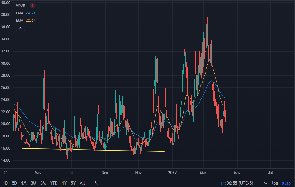
VIX Chart
It's fascinating how equities have trouble seeing further upside after all the juice comes out of the options market.
When the VIX crashed from 35 to 20, that "vanna squeeze" absolutely drove the markets higher.
We did have squeezes above 20 that were faded when vol sellers showed up. This reinforces the idea that rotation, improved liquidity, and tighter ranges could come into play soon.
And as I said last week — if the VIX stays in a range for a few weeks, we can make a case for buying some vol exposure. Until then, it's best to let this shake out on its own.
That’s all for this week’s Market Primer. One more thing:
If you’d like to learn the Trading Roadmap I used for each week’s analysis:
Watch this free presentation ASAP.
Original Post Can be Found Here