If you’re looking to actively trade a market, one single trade will not “make” your trading career.
It’s better to find an edge, build it out, and use it as much as you can.
I’m going to share with you a technology inside our Trading Roadmap that can tell you areas with the best odds of rejection.
That means you can use them for support and resistance and profitably trade against them.
It’s called a “Low Volume Node,” or LVN for short.
This is a zone within our Trading Roadmap without much volume traded at it. It will often be reinforced by key reversals against that level.
While we can view a “High Volume Node” as an attractive force, an LVN is a repellant.
Here’s an example using the Russell 2000 ETF, IWM:
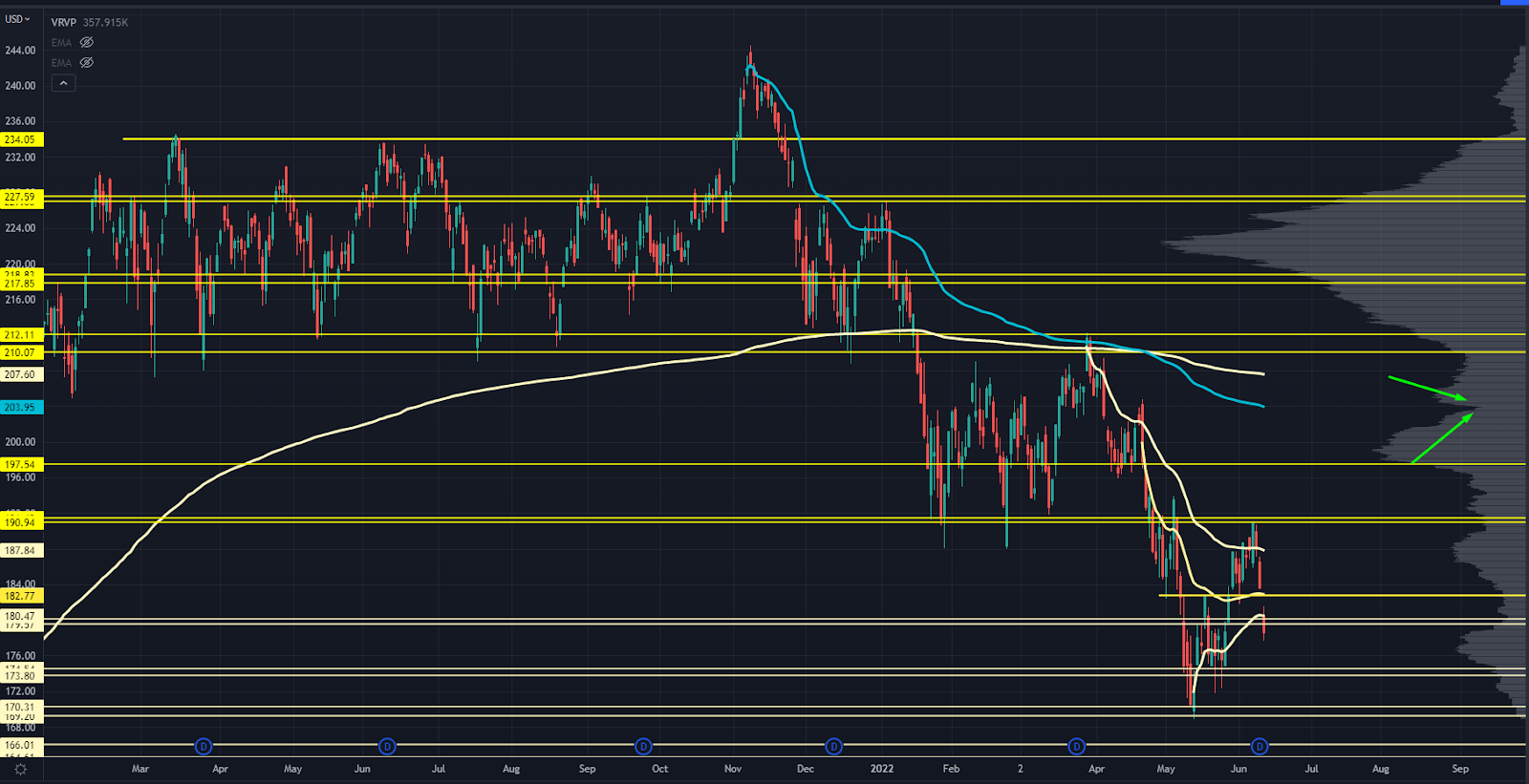
IWM Chart showing LVN point
Those green arrows point to a small LVN. What happens if you place a line against that zone?
Check out how often it acts as a key pivot level:
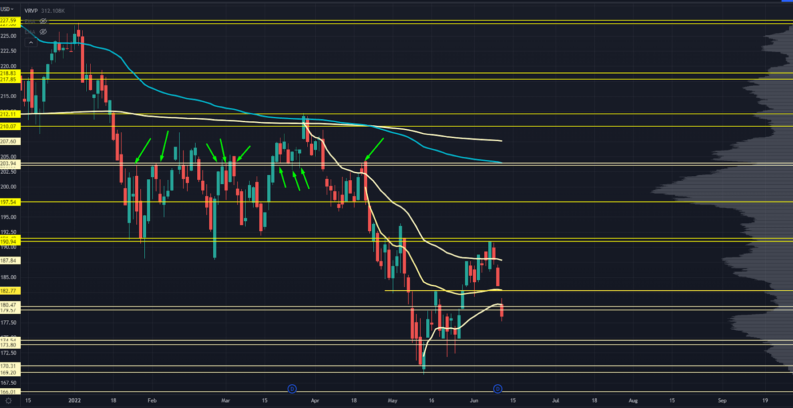
IWM Chart Close Up with Pivot Points and LVN
Of course, the LVN won’t give you the exact top or bottom for the year.
But if you simply traded against that level, you could find some killer opportunities.
Now, if you’re following along, you might be wondering if this is all “hindsight.”
Let’s take a look at how well this works with zero look-forward data.
Take SPY — the S&P 500 ETF — during the 2016 - 2018 market rally:
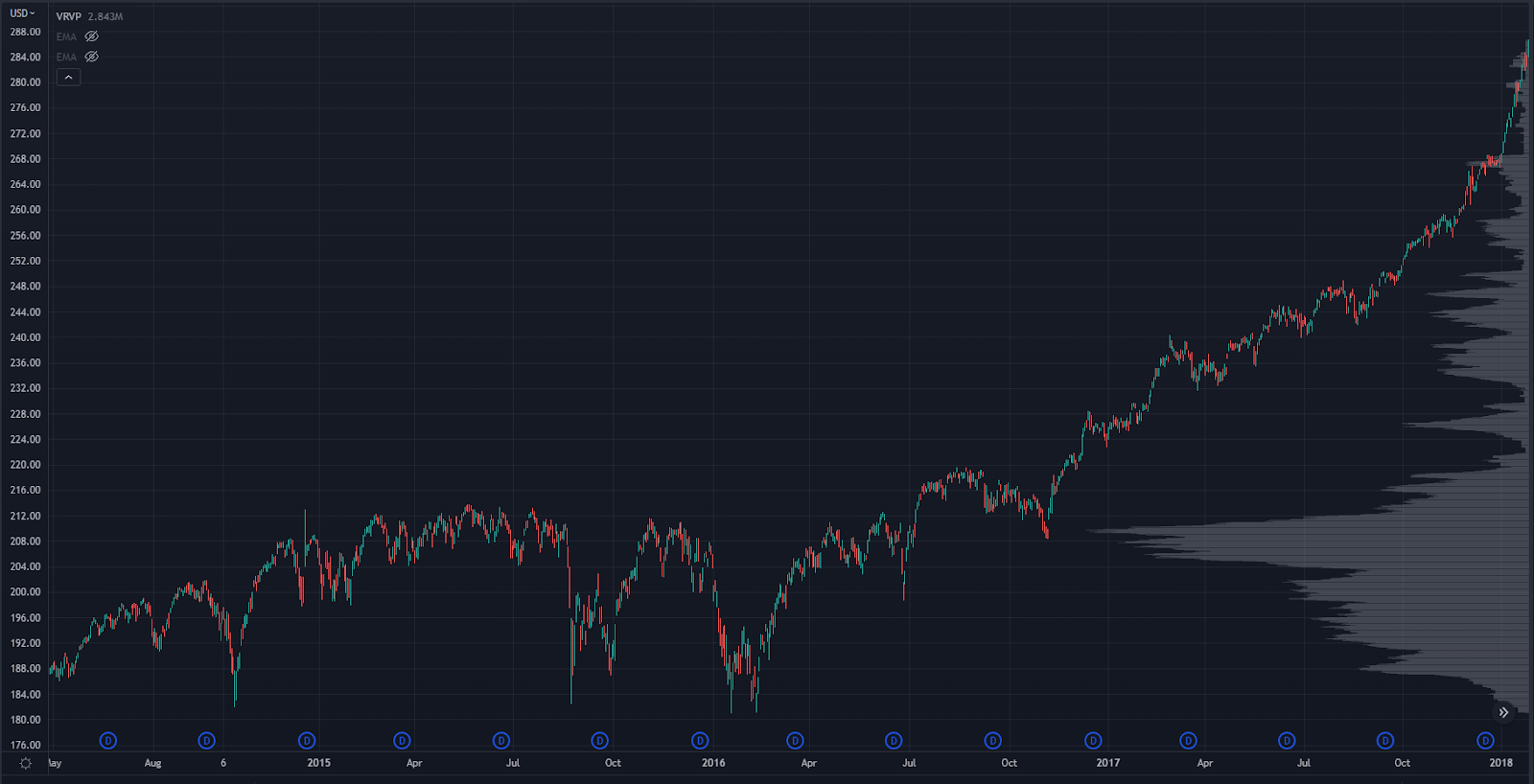
SPY Chart 2016 - 2018
A ton of volume traded in the 2014-2016 range highs, so we’ll create a Roadmap just from the 2016 lows to the 2018 highs:
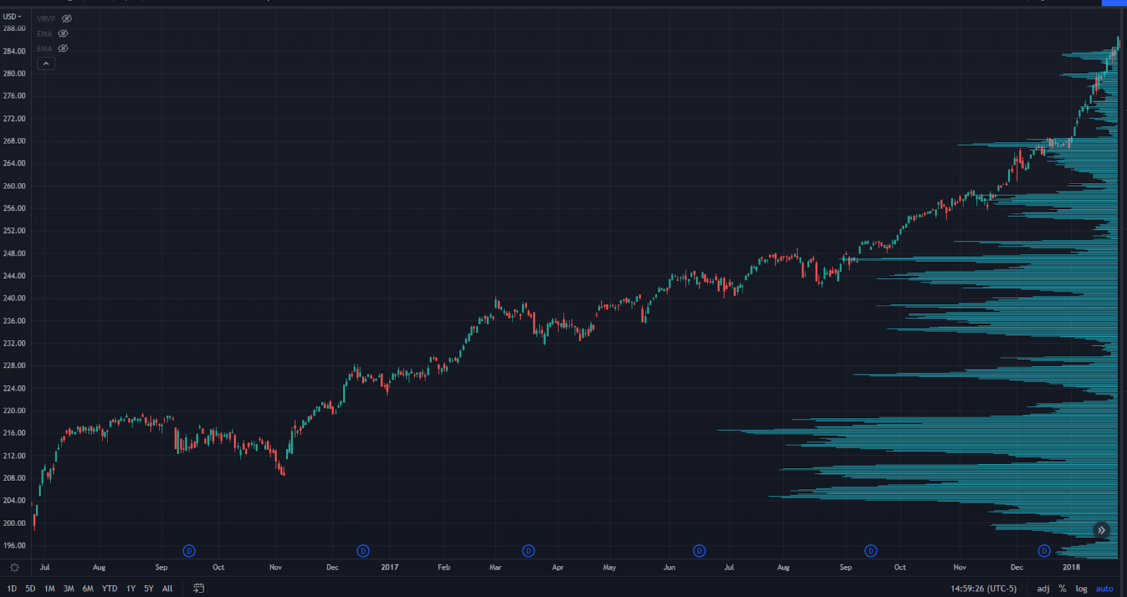
SPY Chart showing volume 2016 - 2018
Next, we’re going to line up some zones where some LVNs sit. Remember, this is only using data that we have on our chart right now.
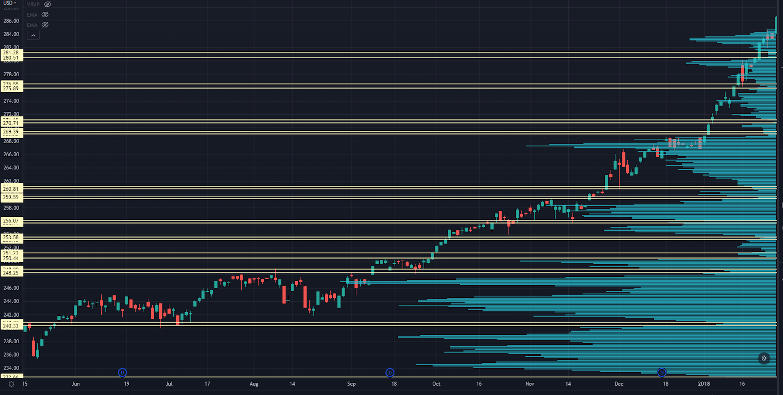
SPY Chart with LVN zones
Now, let’s see what happened with the February 2018 market crash – what we call “Volmageddon.”
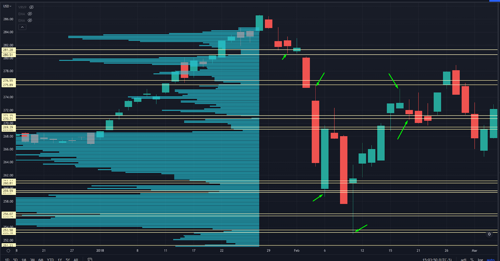
SPY Chart from February 2018 with Volume Indicator
That’s pretty good, right? Those levels were created before the crash told you where we had the best odds of reversing.
Of course, 2018 had two separate market crashes. How did it do then?
Let’s look:
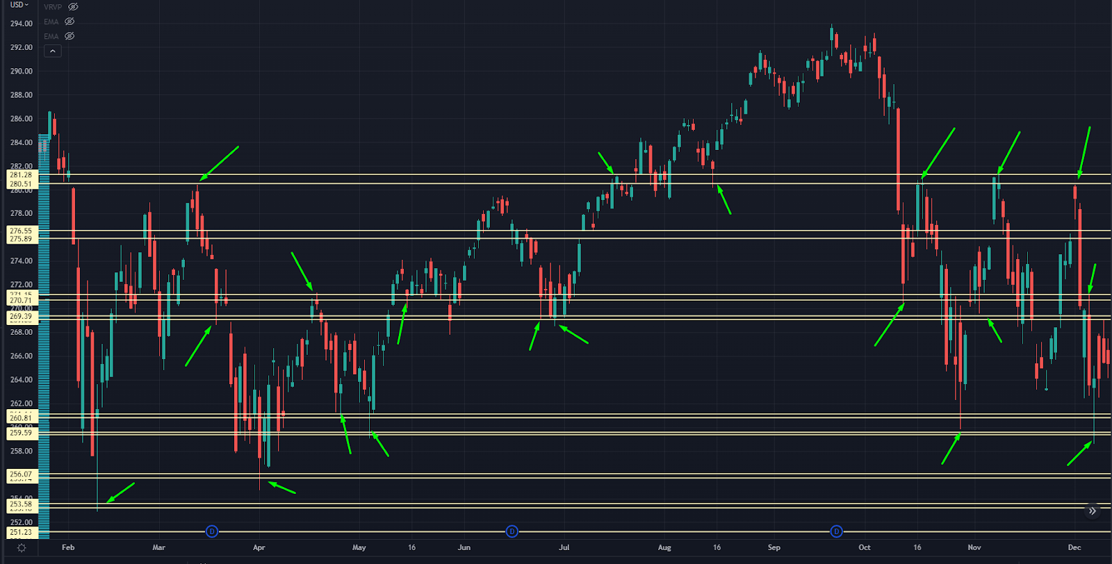
SPY 2018 Chart with Key Pivot Points and Volume Indicator
Again, this is catching some of the market’s largest moves.
As time goes on, these levels will evolve as more trading volume kicks in. But can you see how well this works with forward data?
Let’s try another example — The December 2018 bottom:
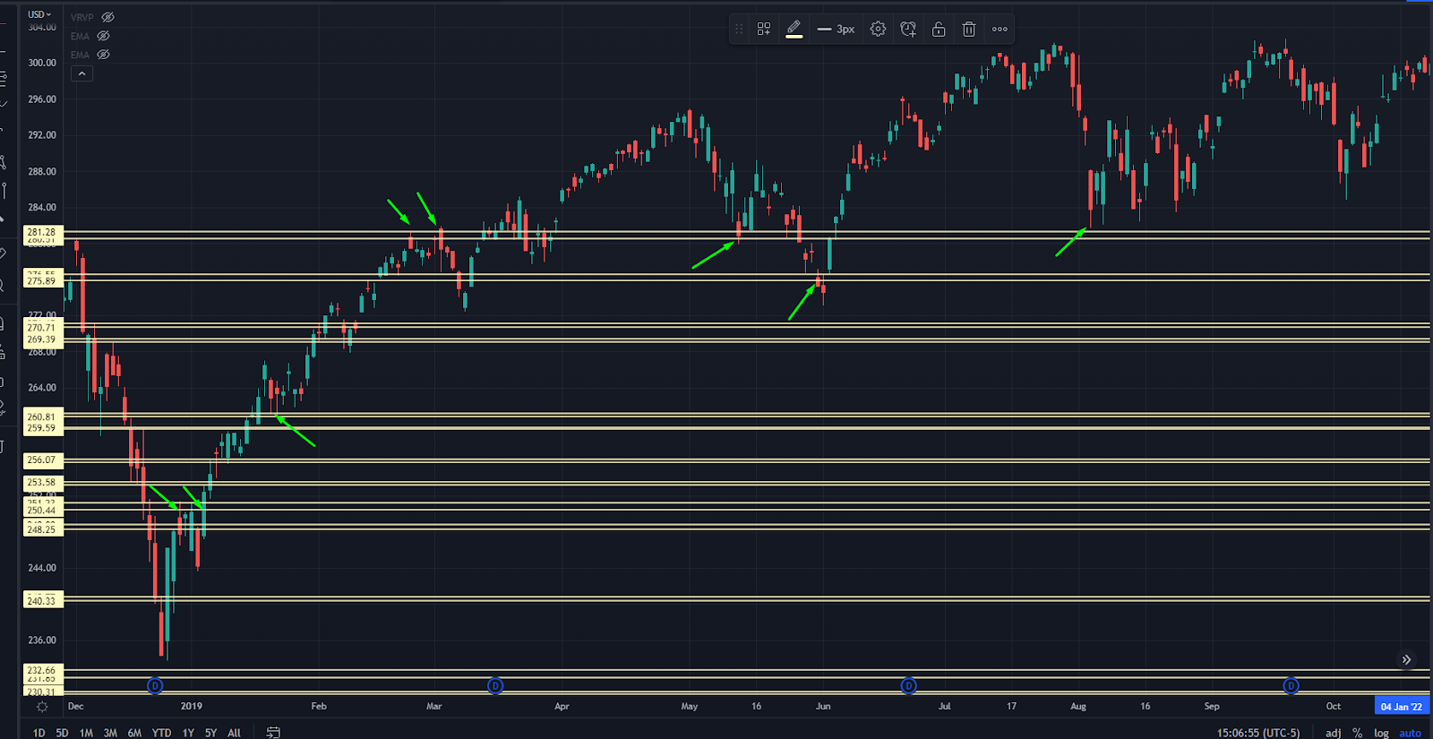
SPY Chart from December 2018 with Key Pivot Levels
We’re getting fewer signals with these levels, but you can see — clear as day — how price is responding to levels built out over a year ago.
These LVNs, along with other tools like HVNs and volume shelves, are why we use our Roadmap…
And why you need to get trained up on it immediately.
Go here for a free training on our Roadmap now.
Original Post Can be Found Here